Coastal colour palettes for Frankston and Mount Eliza
Palettes that survive Peninsula light — salt-washed neutrals, ti-tree greens, and the dark clifftop look — with notes on testing, heat and heritage overlays.
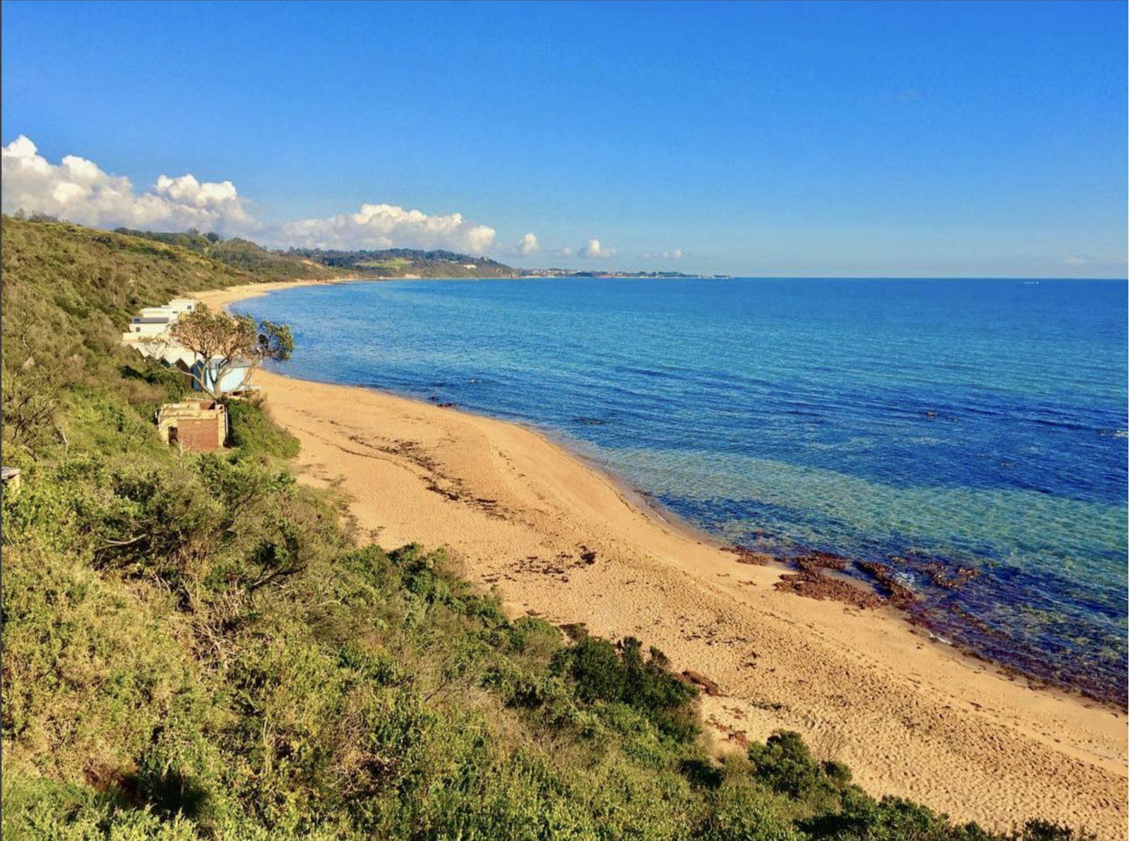
Stand on Olivers Hill at four in the afternoon and the housing stock teaches colour better than a fan deck. Pale renders pick up the bay. Weatherboards in dusty green sit under tea-tree. A few clifftop boxes go near-black and dare the sun. Frankston and Mount Eliza share a coastline and split a temperament: one still suburban and mixed, the other more landscaped and self-conscious. A palette that belongs here has to survive salt, UV, and a green landscape that turns cool greys slightly sick.
This sits in the colour hub. Product systems are a different article: Weathershield versus All Weather.
The Peninsula light, in practice
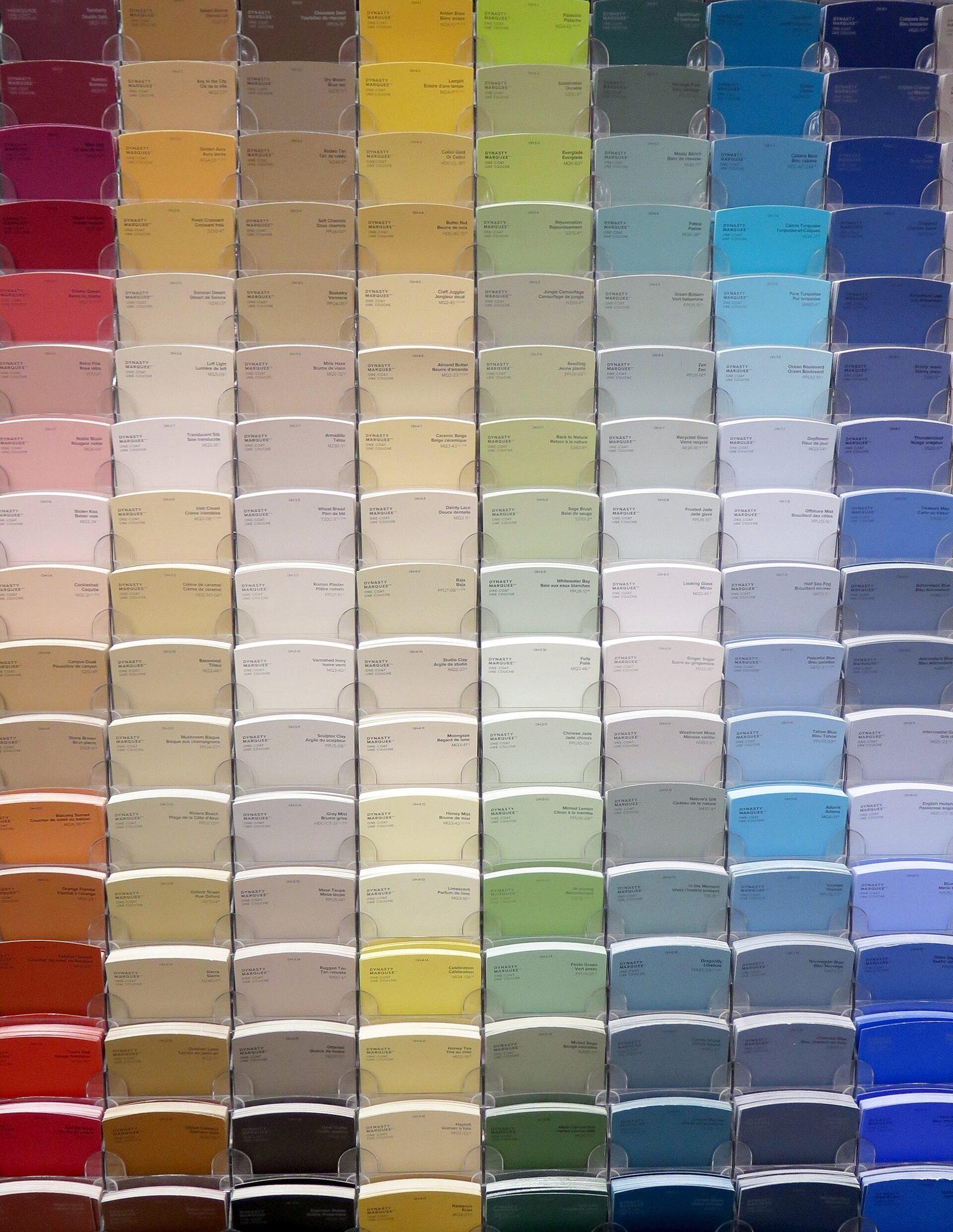
Morning light off Port Phillip is hard and slightly blue. Afternoon light through ti-tree is green-gold. South rooms in July are cool and dim. A sample viewed in a fluorescent paint barn on McDonald Street will lie about all three.
Rules of thumb:
- If a grey looks blue in the shop, it will look colder on a south weatherboard.
- If a white looks bright in the shop, it will look clinical next to a cream neighbour and dirty after a season of salt.
- If a green is yellow in the shop, the garden will push it toward khaki.
Test on the weather side and the shaded side. Leave samples up for a week. The testing guide is written for interiors; steal the method for exteriors.
Four palettes that actually occur on these streets
1. Salt-washed neutral. A warm mid grey or greige wall, paler trim, a deeper door. This is the default successful Peninsula scheme. It hides chalk a little, loves render, and does not fight brick if you are on trim-only veneer. Avoid greys with a strong blue undertone unless you have a lot of warm timber to answer them.
2. Sandy coastal white. Not untinted white. A white with a drop of raw umber or a named “quarter” strength of a stone. Weatherboards lap into shadow; a dirty white still reads white from the street. Pure white on a Seaford weatherboard becomes a maintenance chart of every downpipe splash.
3. Ti-tree and olive. Deep but not black-green walls, pale trim, brass or timber door. Works on bungalows and on newer boxes hiding in a garden. Fails when the green is too yellow or too mint. Look at the actual foliage in August, not the memory of January.
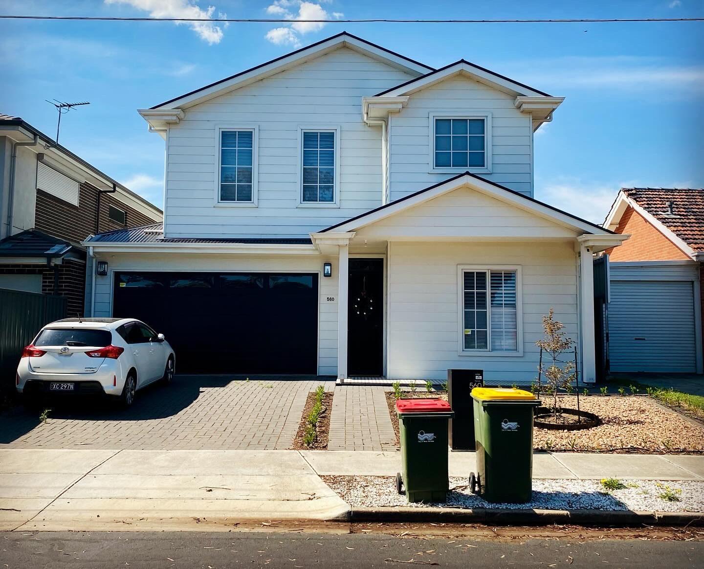
4. Clifftop dark. Charcoal, deep bronze, near-black. Common in Mount Eliza and parts of Mornington. Specify a premium exterior, accept a shorter colour-hold, and keep trims considered so the house does not become a hole in the sky. Heat on north-west walls is real. See how long exterior paint lasts.
Brick, render and weatherboard change the same colour
A grey that is calm on render can look thin on orange brick mortar if you only paint timber. On weatherboards it will read darker because of laps. Always sample on the actual cladding. A4 cards are not a wall.
If you are on face brick, the brick is already a colour. Your “palette” is fascia, window, door, maybe a painted infill. Fighting orange brick with a cool grey fascia is a common Frankston argument that the brick wins.
Heritage overlays and “coastal” are not enemies
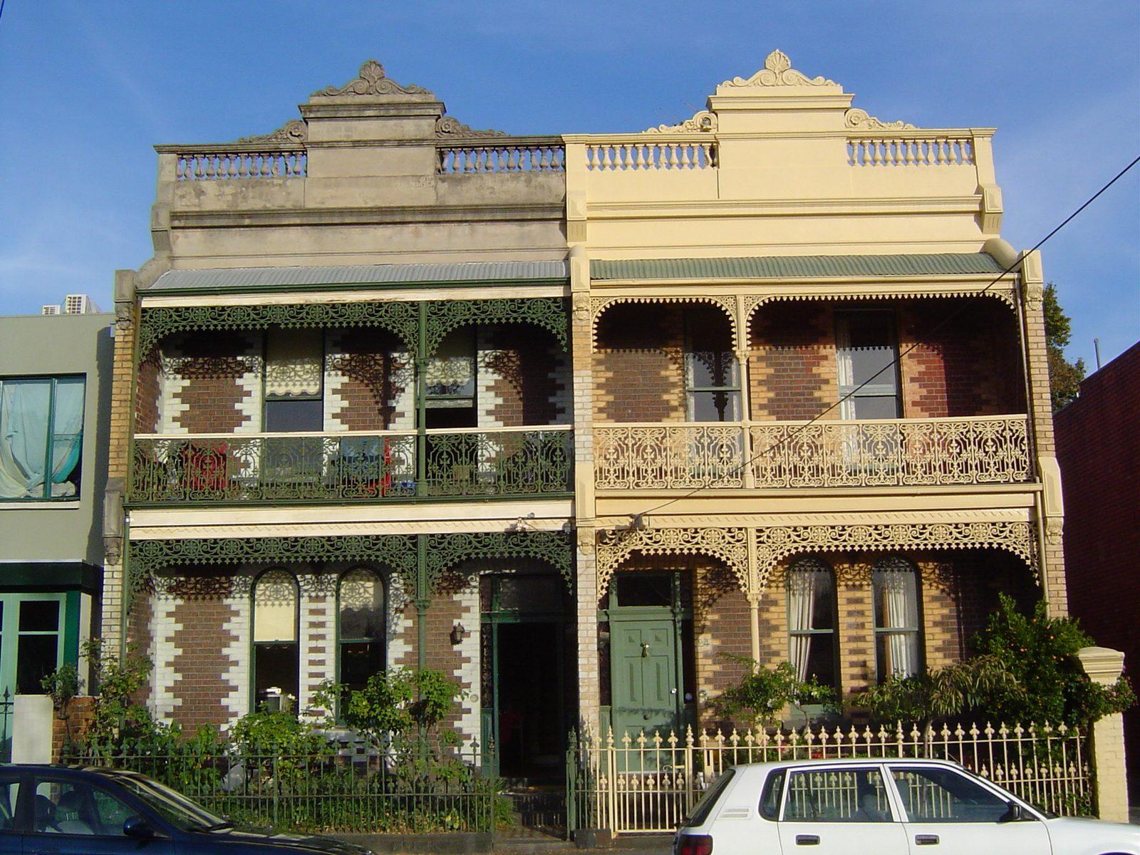
Parts of Mornington, Mount Eliza and older Frankston streets sit in overlays or just in a strong period character. Coastal does not have to mean 2016 charcoal. A Victorian or Edwardian can take a coastal lightening of a heritage scheme — paler walls, still-deep joinery — without dressing as a barn. The heritage colour guide is the longer treatment.
Interiors that match the outside without copying it
Bringing the exterior grey straight through the front door often deadens a south hall. Shift it warmer and lighter inside. Keep the saturated moments for doors, not for every wall. Open-plan kitchens that face the garden can take a slightly greener off-white than the street elevation. Continuity is a family resemblance, not a uniform.
A short, opinionated do-not list
- Do not pick a colour from a single Instagram house in Bondi. Different sea, different light.
- Do not use untinted white on weatherboards “for the coastal look”.
- Do not specify five pastels on a 1962 veneer.
- Do not choose a dark exterior without reading the system’s heat advice.
- Do not sign off a colour in the shop car park at noon.
Palettes are local. Walk the block at dusk before you tint 40 litres. The neighbours have already run the experiment.
Roofs, driveways and the colours you already paid for
Exposed aggregate in warm brown, a terracotta tile, a charcoal Colorbond — these are the palette whether the fan deck agrees or not. Pull the body colour toward them, not toward a magazine house with a pale concrete driveway you do not have. If the roof is next, wait. Painting twice to chase a future charcoal roof is how costs balloon.
Front doors as the only saturation
If you need a colour that makes you happy, put it on the door. Walls have to sit in salt and UV for a decade. Doors can change in an afternoon. Oxide red, deep green, a blue that is not electric — test the door in the porch light at night so guests can find it.
Plants are a colour
Ti-tree, olive, pittosporum and a winter lawn are already a scheme. Mint greens fight them. Olives join them. Pink-beige walls can go salmon next to certain bricks and certain succulents. Look at the garden in August, when it is least flattering.
Undertones next to brick and Colorbond
Cream brick with a cool grey fascia is a fight the brick wins. Orange brick with a yellow-based cream can go ginger. Hold the sample against the actual brick in shade and sun. Colorbond “Woodland Grey” roofs pull walls cooler; “Manor Red” roofs want warmer bodies or a very confident contrast. If you cannot name the roof colour, photograph it and ask the trade counter to identify before you fall in love with a wall grey.
A sample set that has worked on this coast
Not a prescription, a starting shortlist to test: a warm mid grey, a sandy off-white, a deep but not black green, a charcoal for people who will maintain it, and a cream with no blue. Throw away any that go icy on the south wall. Keep the one you still like on a Tuesday.
Palette is local manners. The bay supplies the glitter. The house only has to not argue.
People also ask
- What colours suit a coastal house in Victoria?
- Mid greys with a bit of warmth, sandy whites that are not blue, deep greens that pick up ti-tree, and restrained blacks on clifftops if the system can take the heat. Cool blue-greys often go icy in Frankston’s south light.
- Should coastal houses always be white?
- No. Pure white shows every salt stain and every lap. A slightly greyed or sandy white is easier to live with and still reads as coastal.
- Do dark houses fade faster near the bay?
- They take more UV and heat, so colour hold and film stress are harder. Dark still works with a premium system and a maintenance plan; it is not a set-and-forget.